
Game Art Bible Template: Filled In With a Real Game
A complete game art bible, filled in for a real game with measured hex values, saturation bands and canvas sizes — plus a blank template you can copy for your own project in about an hour.
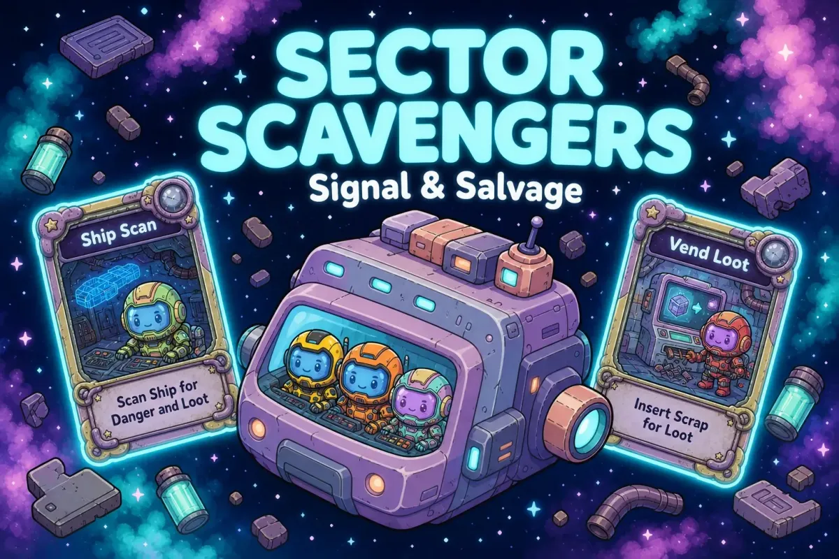
We didn't write this art bible and then make the art for it. We used Makko like a living mood board to create the art first, all of it inside a single Makko collection, which binds the game's look, feel and style together for consistency. Afterwards we measured what we had and wrote it down.
That order is worth stating. Building a mood board is usually the first thing an artist does before writing an art bible, and Makko is where we did that exploration. We had 123 finished assets before anyone wrote a word, so nothing below is a guess. Every number here describes art that already exists. There's a blank version at the bottom if you want to do the same for your own game.
If you want the reasoning behind the rules rather than a finished example, that's the companion piece: how to write a game art bible.
Most art bible templates fail the same way. They give you the right headings and then let you write adjectives underneath them. "Palette: warm, gritty." "Level of detail: medium." You can't hold either of those up against a finished asset and get an answer out of it. A rule you can't check is really just a preference, and preferences don't survive a second artist, a freelancer, or a model that renders your character another forty times.
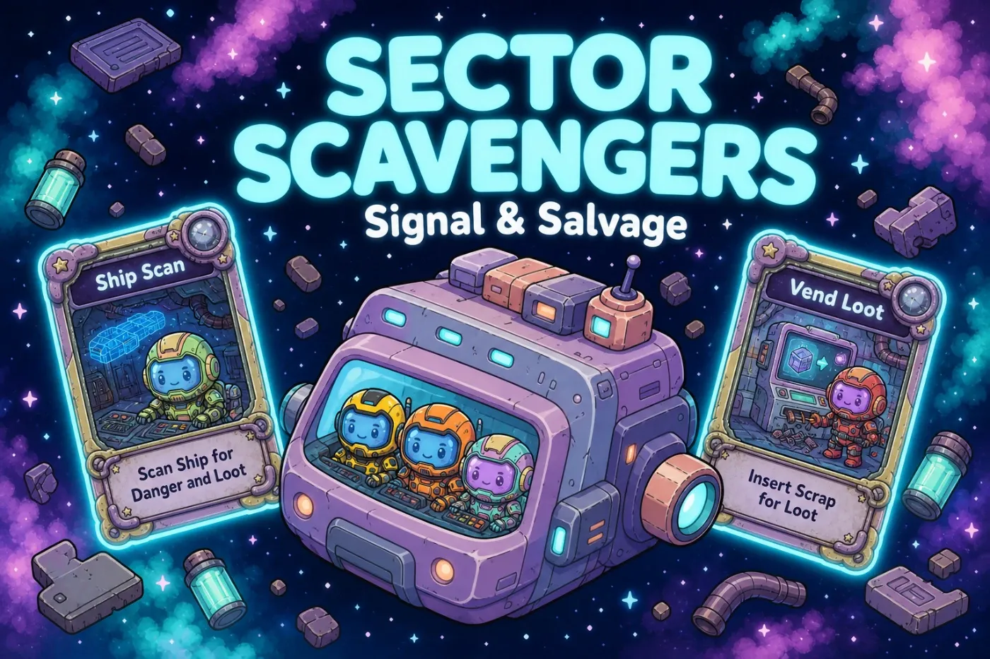
See the pipeline first
An art bible describes what the art has to be. The video below shows how it actually gets made: concept art, reference sheet, animations, baked sprite sheet, then the character running in a game. Watch it if you want the production context. Skip it if you're here for the template.
How the numbers in this document were produced
Saturation and value figures below were measured, not estimated. Each asset was decoded, downsampled to 192×192, converted to HSV, and averaged across every pixel above 200 alpha. Character measurements exclude the white studio background. Palette hexes come from a 16-step quantization of the same images, ranked by pixel share.
It matters because there's a real difference between telling someone "the characters should pop" and giving them a number they can hit. If you build your own from the template below, measure your own art rather than borrowing ours. The method is the part worth copying.
0. Ownership and version
| Field | Value |
|---|---|
| Game | Sector Scavengers: Signal & Salvage |
| Document | Art bible v1.1 |
| Owner | Art lead. One named person. Changes go through them. |
| Master copy | The Sector Scavengers Cohesive collection in Makko. The collection is the bible's source of truth; this document describes it. |
| Scope | Crew, ships, salvage props, room backgrounds, cards, HUD and icons. |
| Last reviewed | Against 125 shipped assets. |
An art bible with no named owner turns into a wiki page nobody enforces. Fill this row in first.
1. The visual target
Three pillars. Each is phrased so an asset can fail it.
| Pillar | What it means | How an asset fails it |
|---|---|---|
| Cute crew, hostile sector | The characters are round, bright and readable. Everything they move through is dim, worn and slightly too big for them. | A crew member rendered grim, or a room rendered cheerful. |
| Salvage, not shine | Ships and props are patched, dented, mismatched. Nothing in the sector looks factory-new except the crew's own suits. | A clean, unweathered hull or prop. |
| Read it in one second | At the size it ships, a player should identify who and what before reading any text. | Two crew members you can't tell apart at 64px. |
That tie-breaker line does a lot of work and almost no template asks for one. 0 A.D.'s Art Design Document handles it in eight words: "Gameplay trumps Realism when the two topics disagree."
A filled-in art bible is not a prompt. Most of it never gets typed into a prompt box at all, and typing it there usually makes the output worse rather than better.
| Rule type | Where it lives |
|---|---|
| Look, feel, style, palette, line, rendering | Collection settings. Set once at the top and inherited by everything made inside it |
| View, angle, framing, canvas size | The controls. Concept art already has a front setting. Restating it in words fights the tool |
| What this particular asset is | The prompt. Silhouette, outfit, materials, hardware. The part that makes this asset itself |
| Everything else | The review checklist. Things you check after generating, not instructions you send |
The rule of thumb: if a control already sets it, don't say it again in words. A prompt that repeats a dropdown is a prompt arguing with the tool, and the tool is also expanding your prompt behind the scenes with detail you didn't write. Overriding that with your own phrasing throws away the part you didn't have to do.
This is the difference between a bible that helps and a bible that gets in the way. The document exists so a human can check work and brief other people. It is not a script to be pasted.
2. The non-negotiables
These six are repeats from further down. They're up here because they're the ones people break. Read this section before every asset. The rest you only need once.
- Crew are roughly twice as saturated as everything else. Characters land near 50% mean saturation; rooms, ships and props near 24%.
- The suit carries the identity. The face never does. Every face plate is
#6B7D95purple with glossy eyes. - Every asset has a black outline that survives to the smallest size it ships at.
- Canvas size is set by asset class. 1024×1024 crew, 512×512 props and ships, 1920×1080 rooms.
- Rooms sit below the crew in value and saturation. Always. The room is scenery.
- Nothing in the sector is new. If it doesn't read as used, it isn't finished.
3. Canvas, scale and framing
| Asset class | Canvas | Background | Framing |
|---|---|---|---|
| Crew character | 1024 × 1024 | Solid white, no shadow | Full body, front view: the concept art default. Feet on an implied baseline, arms clear of the torso |
| Ship / salvage prop / icon | 512 × 512 | Transparent PNG | Centered, three-quarter from slightly above, 8–12% margin on every side |
| Room background | 1920 × 1080 | Opaque, full bleed | Eye level, flat-on, no vanishing point drift. The playable band is the lower two thirds |
| Card art | 1485 × 2036 portrait | Opaque, framed | Subject centered in the upper two thirds, lower third reserved for the text plate |
| UI chassis (frame, button, panel) | Native, transparent PNG | Transparent | Nine-slice safe: corners must survive being stretched on the middle edges |
Of nine shipped room backgrounds, three are 1920×1080, two are 2560×1440 and two are 1536×1024. Nobody decided that. It happened one asset at a time, and by the time anyone noticed we were rescaling backgrounds in the engine instead of shipping. Write the canvas number down before the second asset, not after the ninth.
4. The color system
4.1 The saturation contract
Everything else on this page leans on this one. Two things are worth keeping apart, though: what we measured, and what you should aim at.
| Layer | Mean saturation | Mean value | Measured on |
|---|---|---|---|
| Crew | 42–56% (mean 49.5%) | 48–61% | Ruby, Marge, Lucas, Roger |
| Ships and salvage props | 21–25% | 49–57% | Junker, three derelict hulls, debris pile |
| Room backgrounds | 15–31% (mean 24%) | 25–77% | Nine shipped rooms |
Those are measurements, not targets. Nobody set out to hit 49.5%. The collection produced it and we measured it afterwards. What is worth copying is the gap, not the figures.
The second half matters more than the first. When a character disappears into a background the instinct is to push the character, and if you keep doing that you end up with a cast of neon fighting itself. Pull the room down instead. There's far more headroom at the bottom of the saturation range than at the top.
Biff and Yuri were re-rendered after this band was measured, so they were not part of it. Yuri lands inside the band at 47.8%. Biff measures 61.5%, above the 42–56% ceiling, and is queued for a re-render. The band describes the cast that produced it; it does not get widened to accommodate a new asset.
4.2 Crew identity colors
Each crew member owns a suit hue. At small sizes it's the only thing telling them apart, so treat it as reserved. Two crew members can't share one.
| Crew | Suit | Face plate | Silhouette note |
|---|---|---|---|
| Yuri | #7070d0 indigo, #5040a0 shadow | #6B7D95 purple | Backpack canister, chest readout, strapped ankles |
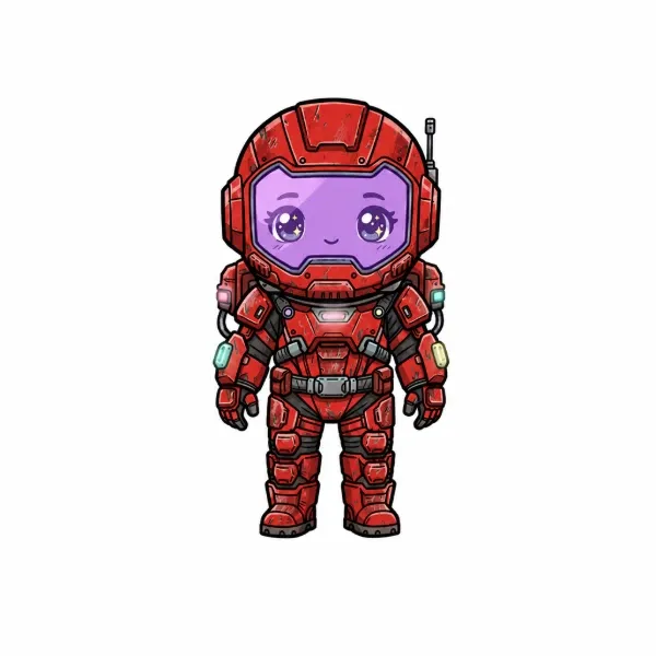
| Ruby | #d03020 red, #902020 shadow | #6B7D95 purple | Narrow shoulders, ribbed torso |
| Marge | #904050 rose over #ffc0c0 | #6B7D95 purple | Tallest helmet, softest edges |
| Biff | #3090f0 cerulean, #2060b0 shadow | #6B7D95 purple | Ribbed collar ring, coiled cable, heavy boots |
| Lucas | #f09040 orange with #f0e090 trim | #6B7D95 purple | Split-tone suit, angled visor |
| Roger | #d05030 red-orange | #6B7D95 purple | Compact, minimal hardware |
Crew. Identity huesSector Scavengers · Signal & Salvage
Owner: Tony Valcarcel, art lead
Hues measured off shipped art
One hue per crew member, never shared. The face plate is the constant. It never carries identity, which is what frees the suit to be loud.
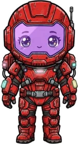
#d03020 · 5.5°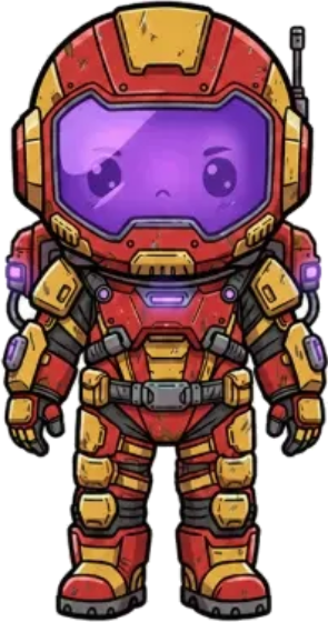
#d05030 · 12.0°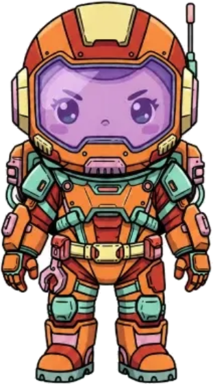
#f09040 · 27.3°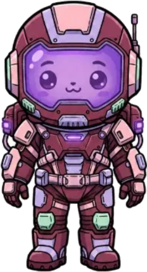
#904050 · 348.0°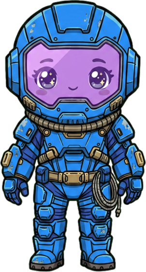
#3090f0 · 208.0°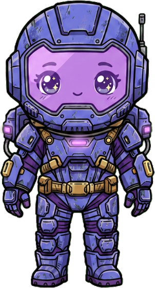
#7070d0 · 240.0°Four crew were packed into 39° of warm, and Biff sat 0.5° from Lucas. A shared hue by any honest reading. The two replacements went into the widest empty arcs: 32° apart from each other, and clear of brass, mint, signal cyan and the HUD blue.
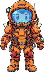
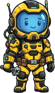
Both wore blue #60c0f0 face plates with flat cartoon eyes while the other four wore purple plates with glossy eyes. Two treatments meant the face was quietly carrying identity after all. Blue plates are out of the palette: every crew member is #6B7D95, glossy.
#6B7D95 purple, with glossy eyes. Never the suit color.That one constraint does more than it looks like it does. Because nobody is using the face to tell characters apart, the suits are free to be as loud as they want without the cast splitting into six unrelated designs. Drop it and every crew member turns into a separate color study.
4.3 World and UI palette
The sector is mauve, plum and brass. The crew is warm and saturated. Those two ranges don't trade places.
| Role | Hex | Where it may appear | Where it may not |
|---|---|---|---|
| UI chassis | #907090 | Card holders, buttons, HUD housings, panel edges | On a character, ship or salvage prop |
| Chassis shadow | #806080 / #152338 | Bevels and recesses inside UI parts | As a flat fill anywhere |
| Brass | #d0b070 | Bolts, rivets, corner hardware | Large surfaces. Brass is punctuation |
| Mint bevel | #709080 | The inner lip of every UI frame | Outside UI |
| HUD screen | #002060 | Live readouts and scan displays only | Static decoration |
| Signal cyan | #a0ffff | The logo, and anything demanding a click right now | More than one element on screen at a time |
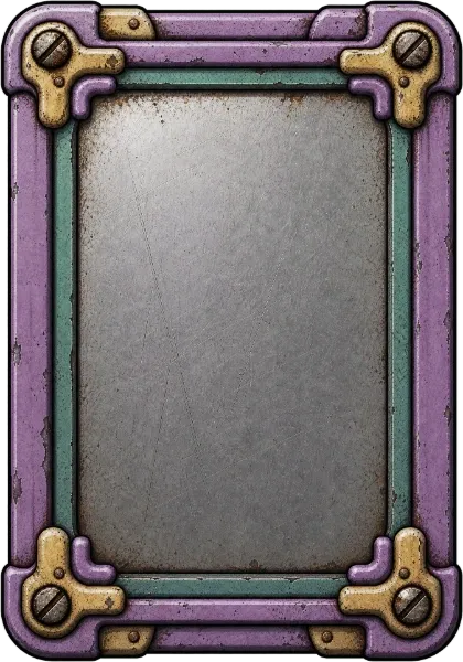
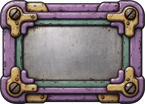
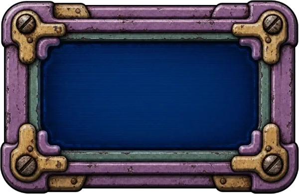
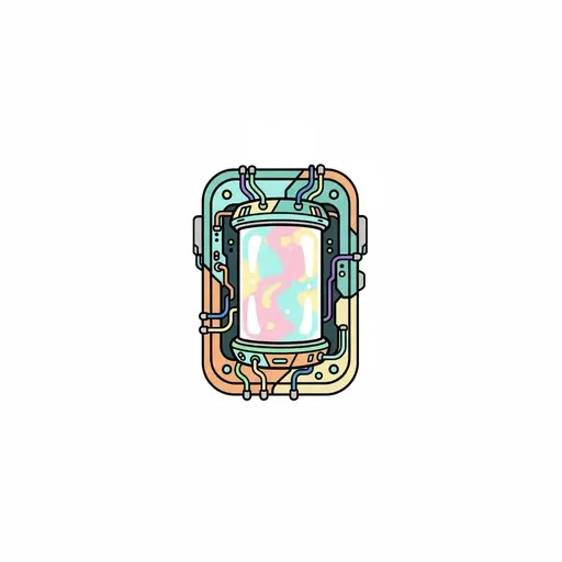
Three different components, one chassis language: mauve plate, brass corner bolts, mint inner bevel, scratched gray inset. That didn't come out of careful prompting. It came out of writing the role table down first.
5. Line, edge and rendering
| Rule | Spec | Check |
|---|---|---|
| Outline | Black or near-black, closed, unbroken around the exterior silhouette | Zoom to 400%. Trace the outside edge. Any gap fails. |
| Outline weight | Scales with canvas: heavier on 1024 crew, lighter on 512 props, so both read the same at ship size | Shrink to ship size side by side. The lines should look equally heavy. |
| Interior line | Present but lighter than the exterior line | The silhouette edge must be the darkest line in the asset. |
| Rendering | Flat base color, one shadow step, one highlight step. Soft airbrush gradients are out. | Count the tones in one material region. More than four, simplify. |
| Detail floor | Anything smaller than a crew member's hand is implied by color, not drawn as a shape | If a detail vanishes into mush at ship size, it should not have been a shape. |
The detail-floor rule is borrowed straight from 0 A.D., which says nothing smaller than a human hand gets modeled. It gets textured instead. Ported to 2D, it's the fastest way to stop someone spending an hour on rivets nobody will ever see.
6. Light and shadow
| Rule | Spec |
|---|---|
| Key light on characters | Upper left, from the artist's point of view, not the character's. Say it out loud in reviews. It's the argument an art bible prevents most often. |
| Character shadow | None baked into the 1024 portrait. The engine casts it. A baked shadow doubles up in game. |
| Room light | Motivated and visible in frame: a window, a strip light, a screen. Rooms are lit from inside the fiction. |
| Room contrast | Deepest darks in the corners, lightest values in the upper third. The playable band stays mid-value so crew read against it. |
| Emissive | Only screens, thrusters and hazard strips emit. Nothing else glows. |
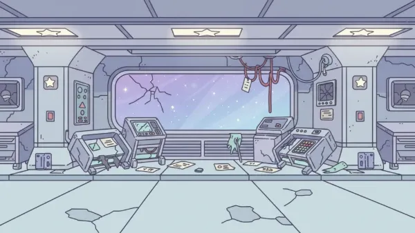
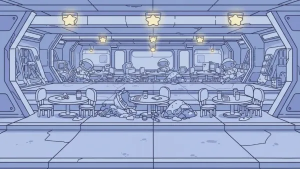
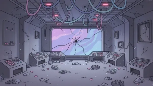
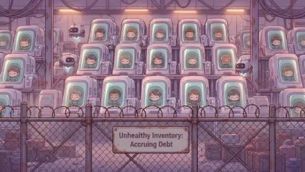
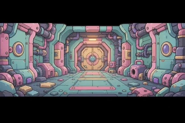
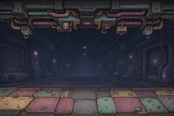
Three rooms, three brightness levels, one saturation band. The corridor and mess hall are bright, the bridge is dim, and all three sit well below the crew in saturation. That's why a character reads instantly in any of them without the rooms needing to look alike.
7. Crew specification
| Property | Spec |
|---|---|
| Proportion | Roughly three heads tall. Helmet is the largest single form. |
| Pose | Neutral, symmetrical, arms clear of the torso, legs slightly apart. Nothing occluded. |
| Face | Flat #6B7D95 plate, no rendered skin texture, glossy eyes with a highlight. One treatment, six of six crew. The face is the constant, so it never tells you who you are looking at. |
| Suit hardware | Chest pack, collar ring, boots. Each crew member varies one of the three, never all three. |
| Reserved | One suit hue per crew member, listed in section 4.2. Adding a seventh crew member means claiming an unused hue first. |
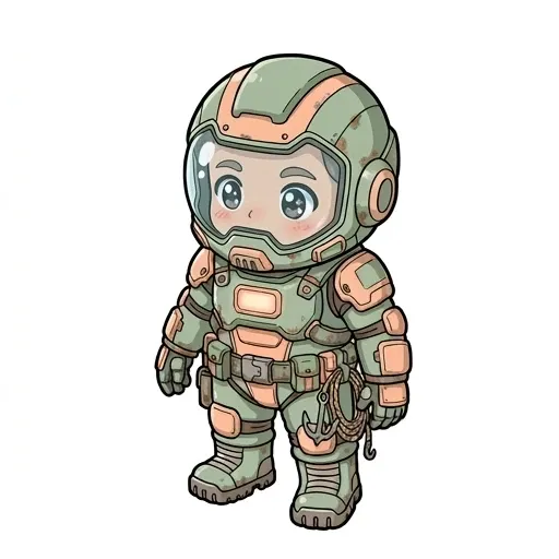
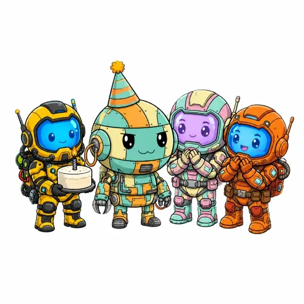
Munch (below, left) is 512×512 where the rest of the crew are 1024×1024, and renders a photographic human face where every other crew member has a flat color plate. It predates the rule in section 4.2. We left it in rather than quietly fixing it, because this is the whole reason to write one of these down. Drift like that is invisible while you're making assets one at a time and completely obvious the second you line them up.
8. Ships, salvage and props
| Property | Spec |
|---|---|
| Canvas | 512 × 512, transparent PNG |
| Angle | Three-quarter from slightly above. Consistent across the whole set. |
| Saturation | 21–25%. Never enters the crew band. |
| Wear | Mandatory. Panel gaps, mismatched plating, scoring around thrusters. |
| Accent | One saturated accent per hull, usually the thruster. It's the only place a prop gets to approach crew saturation. |

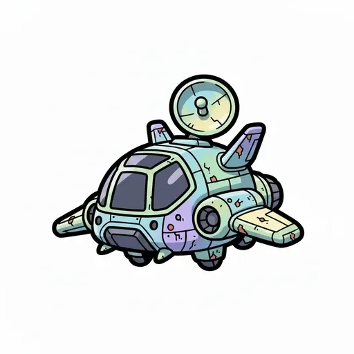
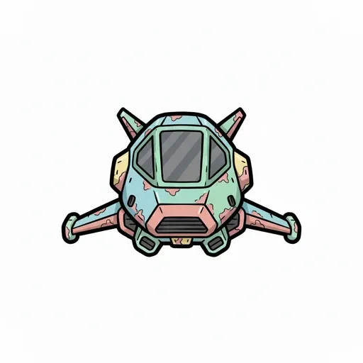
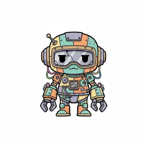
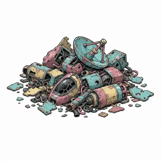
One thing we only noticed afterwards: across the shipped derelicts, the silhouette gets more angular as rarity rises. Rounded at common, winged at rare, hard-edged and military at epic. A player can learn that ladder without reading a single label. Right now it's an accident of three assets, which is a thin sample, but it's the kind of accident worth writing down before it stops being true.
9. Room backgrounds
| Property | Spec |
|---|---|
| Canvas | 1920 × 1080, opaque |
| Camera | Eye level, flat-on. No perspective drift between rooms, since they have to cut together. |
| Playable band | Lower two thirds. Nothing structurally important above it. |
| Saturation ceiling | 31%. Hard limit. This is what protects the crew. |
| Set dressing | Every room shows at least one piece of visible wear and one working light source. |
10. UI, HUD and cards
Most art bibles skip this section, and it causes more rework than any other. Interface art runs into gameplay art constantly. Put a HUD in the crew's saturation band and it'll fight the crew for the rest of the project.
| Rule | Spec |
|---|---|
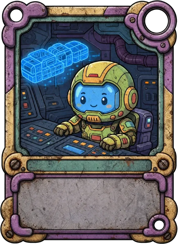
| Chassis | Mauve #907090 plate, brass #d0b070 corner bolts, mint #709080 inner bevel, scratched gray inset. Every frame, button and panel. |
| Screens | #002060 only. If it is that blue, it is live data. |
| Attention | Signal cyan #a0ffff, one element per screen. |
| Value limits | No pure black and no pure white in UI. Both are reserved: black for outlines, white for the character studio background. |
| Card layout | Subject in the upper two thirds, text plate in the lower third, frame unbroken on all four sides. |
| Nine-slice | Corners are fixed art. Only the middle edges may stretch. |
The no-pure-values rule is lifted from Riot's public VFX style guide for League of Legends, which advises avoiding the extremes of 0 and 100 and leaning on the mid-range, so an effect always has somewhere left to go when it needs to read louder than the one beside it. It looks like a color rule but it's really a systems rule, and it shows up in far fewer art bibles than it should.
11. Animation
| Rule | Spec |
|---|---|
| Source | Every animation is generated from the character's saved reference sheet, never from a single concept image. One source of truth per character. |
| Set | idle, walk, run, jump, attack, cast, take damage, die. |
| Loop | First frame identical to last, except death. |
| Frame budget | Loops 6–10 frames. Attacks 8–12 with visible anticipation and recovery. |
| Sizing | All animations for one character bake at identical frame dimensions. Pick the correct one, make it the reference, match the rest to it. |
| Mirror safety | Sprites flip horizontally in game, so asymmetric hardware (a pack on one shoulder, an antenna on one side) will swap sides when the character turns. Keep the hardware symmetrical or accept the flip. |
12. Readability tests
Three procedures with pass conditions. Run all three before an asset is accepted.
Silhouette
Fill the asset 100% black and show it to someone on the team. They name it correctly in under three seconds, or it fails.
Ship size
Scale to the size it appears in game and sit back to normal viewing distance. You can still tell which crew member it is.
In situ
Composite the asset onto the darkest room and the brightest room. It reads clearly against both, with no adjustment.
| Test | Procedure | Pass condition |
|---|---|---|
| Silhouette | Fill the asset 100% black. Show it to someone on the team. | They name it correctly in under three seconds. |
| Ship size | Scale to the size it appears in game. Sit back to normal viewing distance. | You can still tell which crew member it is. |
| In situ | Composite the asset onto the darkest room and the brightest room. | It reads clearly against both, with no adjustment. |
The in-situ test is the one that catches saturation failures. Run it against your two extremes rather than some mid-tone room, since anything that holds up at both ends will hold up everywhere in between.
13. Do and don't
| Do | Don't |
|---|---|
| Desaturate the room until the crew separates | Brighten the crew until they separate |
| Give each crew member one reserved suit hue | Tint a face plate to match its suit |
| Keep the outline closed at ship size | Let interior lines outweigh the silhouette edge |
| Weather every hull and prop | Ship a clean, undamaged surface anywhere in the sector |
| Use signal cyan once per screen | Scatter cyan across a HUD as decoration |
| Bake every animation from the reference sheet | Animate from a concept image because it was closer to hand |
| Set the canvas size before the second asset | Discover at asset forty that three sizes are in circulation |
Name your failure modes and reviewers can point at them in one word. The Minecraft community style guide is good at this, with its own vocabulary for shading mistakes: banding, pillow shading, pancake shading, mixels. Build your own list as you catch things. It's much easier to fix a mistake that has a name.
14. Files and naming
| Rule | Spec |
|---|---|
| Format | PNG with alpha for anything composited. WebP acceptable for opaque backgrounds. |
| Naming | SS-[Class]-[Name]-[Variant], so for example SS-Character-Yuri, SS-Prop-Card-Holder, SS-Background-Hallway-Middle. Class first so the folder sorts by type. |
| Structure | One collection per game. Sub-collections per asset class. One sub-collection per character inside the character class. |
| Source retention | Keep the concept art and the reference sheet every animation was built from. They are the only way to regenerate consistently later. |
15. Review checklist
Every line here is answerable without opening the rest of the document, which is why this is the part that actually gets used.
- Correct canvas size for the asset class?
- Correct background. White for crew, transparent for props, opaque for rooms?
- Saturation inside the band for its layer?
- If it's a crew member: reserved suit hue, and a
#6B7D95face plate with glossy eyes? - Closed black outline, heavier than every interior line?
- Four tones or fewer per material region?
- Key light upper left, from the artist's point of view?
- No baked shadow on a character?
- Wear present on every hull and prop?
- No pure black or pure white in UI?
- At most one signal-cyan element on screen?
- Passes the silhouette test?
- Passes the ship-size test?
- Passes the in-situ test against the darkest and brightest rooms?
- Named to the convention?
- Source concept art and reference sheet retained?
16. Changelog
| Version | Change | Reason |
|---|---|---|
| 1.0 | Initial document written against 123 shipped assets | First version |
| 1.0 | Face plates restricted to two colors | Cast was fragmenting as suit hues multiplied |
| 1.0 | Room saturation ceiling set at 31% | Measured from the nine shipped rooms, so it just writes down what was already true |
| 1.0 | Room canvas fixed at 1920×1080 | Three sizes were in circulation |
| 1.1 | Face plates cut from two colors to one, #6B7D95 purple with glossy eyes | Two treatments meant the face was carrying identity, which is the one job the rule says it must not do |
| 1.1 | Biff reassigned to #3090f0, Yuri to #7070d0 | Biff sat 0.5° from Lucas on the hue wheel, so the reserved-hue rule was being broken by the art it describes |
Without a changelog the document quietly drifts away from the art it's supposed to describe. One line per change, and always include the reason.
The blank template
Copy the block below into whatever your team already uses. A doc, a wiki page, a README, it doesn't matter. Fill it in against art you've already made rather than art you're planning to make. The rules that hold up are the ones you can point at.
# [GAME NAME]. Art Bible v0.1

## 0. Ownership
Owner:              [one named person]
Master files:       [where the source art lives]
Last reviewed:      [date] against [n] shipped assets

## 1. Visual target
Pillar 1:           [statement an asset can fail]
Pillar 2:           [statement an asset can fail]
Pillar 3:           [statement an asset can fail]
Tie-breaker:        When two pillars disagree, [X] wins.

## 2. Non-negotiables  (fill in LAST, from the rules people keep breaking)
1.
2.
3.
4.
5.

## 3. Canvas, scale and framing
| Asset class | Canvas | Background | Framing |
|---|---|---|---|
| Character   | [px]   | [color/alpha] | [angle, pose, margin] |
| Prop        | [px]   |               |                       |
| Background  | [px]   |               |                       |
| UI          | [px]   |               |                       |
Real-world scale:   [n] px = [n] meters / [n] feet

## 4. Color
Measured saturation and value, per layer:
| Layer      | Mean saturation | Mean value | Measured on |
|---|---|---|---|
| Characters |  |  |  |
| Props      |  |  |  |
| Backgrounds|  |  |  |
Separation rule:    [e.g. characters carry 2x the saturation of backgrounds]

Color roles:
| Role | Hex | May appear | May NOT appear |
|---|---|---|---|
| Primary        | # |  |  |
| Attention      | # |  |  |
| UI chassis     | # |  |  |
| Shadow         | # |  |  |
Forbidden:          [e.g. no pure black, no pure white, no unshifted grays]

Per-character reserved colors:
| Character | Identity color | Constant element | Silhouette note |
|---|---|---|---|
|  |  |  |  |

## 5. Line, edge and rendering
Outline color:      [hex]
Outline weight:     [px, and how it scales by canvas]
Interior lines:     [lighter / same / absent]
Tones per material: [max n]
Detail floor:       Anything smaller than [real object] is color, not shape.

## 6. Light and shadow
Key light:          [direction], from the ARTIST'S point of view
Shadow color:       [hex] at [n]% opacity
Baked shadows:      [yes / no, and why]
What may emit:      [list]

## 7. Per-class specs  (one block per asset class)
### [Class]
Canvas:
Pose / angle:
Budget:             [frames / colors / px]
Rules unique to this class:
  -
  -

## 8. Animation
Source of truth:    [reference sheet / rig / other]
Required set:       [idle, walk, run, ...]
Frame budget:       [n per loop, n per action]
Loop rule:          [first frame = last, except ...]
Mirror safety:      [symmetrical hardware required? yes/no]

## 9. Readability tests
Silhouette test:    Fill 100% black. Pass = [condition]
Ship-size test:     Scale to [px]. Pass = [condition]
In-situ test:       Composite on [lightest] and [darkest]. Pass = [condition]

## 10. UI
Chassis:
Typography:         [font per role]
Attention color:    [hex], [n] element(s) per screen
Value limits:
Nine-slice:         [which regions may stretch]

## 11. Do / Don't
| Do | Don't |
|---|---|
|  |  |
Named failure modes: [your team's one-word vocabulary for recurring mistakes]

## 12. Files and naming
Format:
Naming convention:
Folder structure:
Source retention:

## 13. Review checklist
[ ]
[ ]
[ ]

## 14. Changelog
| Version | Change | Reason |
|---|---|---|
| 0.1 | Created |  |
Real art bibles worth reading
Almost nobody publishes theirs. These are the ones that are actually public, actually detailed, and worth an hour of your time. Every rule above owes something to one of them.
| Document | Who | Why it's worth reading |
|---|---|---|
| Art Design Document | Wildfire Games, 0 A.D. | The most complete one anybody has published. Thirty sections, real budget tables scaled by gameplay importance, a stated tie-breaker, and a detail floor expressed as a real-world object. |
| Liberated Pixel Cup style guide | OpenGameArt / Mozilla / FSF | Camera angle in degrees, shadows as a hex plus an opacity, hue-shift stated as an instruction, and a closing section of the rules people keep breaking. |
| Ultica style guide | Cataclysm: Dark Days Ahead | The shortest and most checkable of the lot. Every heading is the rule itself, and each one names the failure it prevents. |
| Creating Unit Art | Battle for Wesnoth | Exact canvas, exact baseline, a minimum shade count per material, and the light-direction disambiguation every team argues about. |
| League of Legends VFX style guide | Riot Games | The best public document to come out of a large studio. It sets a primary-versus-secondary hierarchy inside a single asset and pushes the whole palette off the extremes of the value range. |
| Visual Style Guide | Revolutionary Games, Thrive | A rare example with a real UI section, named fonts by role, and a visible last-edited date. |
Frequently asked questions
What is a game art bible?
A single document that pins down the checkable visual rules of a game: canvas sizes, color roles and hex values, line and lighting rules, specs per asset class, and the tests an asset has to pass before it ships. Its job is keeping work made weeks apart, or by different people, looking like it belongs in one game.
Can you show me an example of a filled-in art bible?
The whole first half of this page is one, for Sector Scavengers: Signal & Salvage. Real hex values, measured saturation bands, real canvas sizes, and the art each rule was written against. The blank version is further down if you'd rather fill in your own.
What's the difference between an art bible and a style guide?
In games the two get used interchangeably and it isn't worth arguing about. Where people do draw a line, a style guide covers the look and an art bible adds the production rules around it: canvas sizes, budgets, naming, delivery format, and who signs off. This one is the second kind.
What should a game art bible include?
At minimum: ownership and version, a visual target with a tie-breaker, canvas and scale by asset class, a color role table with hex values, line and lighting rules, one spec block per asset class, animation rules, readability tests, a do-and-don't section, file naming, and a review checklist. Sections that only contain adjectives are worse than absent.
Do indie teams and solo devs need one?
A solo dev needs one more than a studio does, just a much shorter one. A studio has an art director enforcing consistency in review. A solo dev has memory, which is worse. The version of you making asset forty has forgotten what the version making asset one decided. Two pages is plenty.
How long should an art bible be?
Short enough that people read it. Eight filled sections beat sixteen half-empty ones, and an unfilled heading in a shipped document teaches everyone that the whole thing is optional.
When should I write one?
After roughly your first ten assets and before your fortieth. Any earlier and you're guessing at the rules. Much later and you're writing a document that contradicts art you've already shipped. Write it by measuring what you've made so far, then work out which parts were accidents.
Why do art bibles drift out of date?
Because nothing forces the document to change when the art does. Two fixes: name one owner, and keep a changelog with a reason column. If you can't state the reason for a rule, delete the rule.
Does an art bible still matter if the art is AI-generated?
It matters more. A generator will happily give you forty plausible versions of your character, each one internally consistent and none of them agreeing with the others. Written rules are what turn that pile into a decision you can actually make: which sheet to keep, which room to desaturate, which canvas to bake at.
Every asset in this document was made in Makko. Collections handle the consistency part for you. Set the style once and the characters, props, backgrounds and animations made inside it inherit it. The art bible handles the rest, which is writing the decisions down so they're still there at asset forty.