How to Write a Game Art Bible (With a Free Template)
An art bible fixes your game's palette, line, silhouette, lighting and detail rules in one document, so work made months apart still looks like one game. What goes in one, why they drift, and a fill-in template.
An art bible is the single document that defines how everything in your game is allowed to look. It fixes the decisions that must stay constant across every asset: palette, line weight, silhouette rules, proportion, perspective, lighting, rendering treatment, resolution and level of detail. The point is that work made by different people, at different times, still reads as one game.
It is the difference between a game with an art style and a game with a pile of art. Traditionally it is a document that artists read and obey. When you generate art, it becomes an input that the generator enforces, which is a bigger change than it sounds and the reason this article exists.
Where art bibles come from
The form is inherited from animation. A model sheet shows a character from multiple angles with notes on proportion, hair, expression and structure, so that a feature film with a hundred animators looks like it was drawn by one person. Work that violates the sheet has a name: off-model.
Games added technical constraints, because game art has to run. A film character can be as dense as the renderer allows. A game character has a triangle budget, a texture size, a bone count, and a distance at which it must still be readable. So a game art bible is a hybrid document: half aesthetic direction, half spec sheet. Most weak art bibles are weak because they only do the first half.
You can read real ones. The 0 A.D. Art Design Document from Wildfire Games is public and specific. It assigns texture sizes by asset tier, caps rigs at 25 bones, requires 30fps animation with identical first and last frames for clean loops, and states the aesthetic target as above-average color saturation on worn, weathered surfaces. That is what a working art bible reads like: opinions and numbers in the same paragraph.
What goes in an art bible
Most articles about art bibles stop at "define your style." Here is the actual enumeration. Every item below is a decision that, left unmade, will produce inconsistency later.
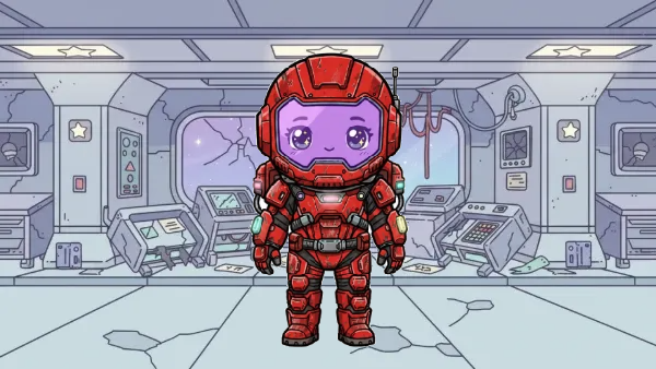 Brightest scenePale corridorReads
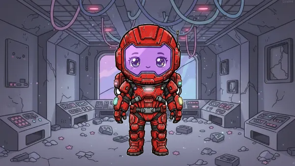 Darkest sceneDim bridgeReads
Thematic statement
One paragraph on the look and the feeling. Not "dark fantasy" but something with a point of view: hand-painted, sun-bleached, closer to a faded travel poster than a fantasy novel cover. Every downstream rule should be traceable to this paragraph.
Palette
The full list of colors with hex values, plus what each one is for: base, shadow, highlight, UI accent, danger, interactive-object tell. Constrain it. More than 16 colors in a single sprite is too many, and hue-shifting should be specified as well, with lights trending red and desaturating while darks lean violet. A palette without roles is a mood board; a palette with roles is a rule.
Every color the game is allowed to use, with a hex value and a stated role. Colors without roles get misused. Measured from shipped art.
Line and outline treatment
Do assets have outlines at all? Constant weight or variable? What color: black, a darkened version of the local hue, or a shared warm brown? Does the outline wrap the full silhouette or break where the sprite meets the ground? Does interior detail get lines, or only value changes? These four answers alone determine most of what people mean when they say two sprites do not match.
Silhouette rules
How a thing reads as a black shape at gameplay size. This is the most load-bearing item in the whole document and the most commonly omitted. Valve's published paper on Team Fortress 2 is the clearest example available: character silhouettes were designed to be distinct from one another, emphasized with rim highlights rather than dark outlines, and interior details such as clothing folds were chosen to echo silhouette shapes rather than fight them. Write down your silhouette test and the size you run it at.
Proportion and scale
Head-to-body ratio for characters. Character height in pixels or units. How tall a door is relative to a character, how tall a tree is relative to a door. Whether proportions are exaggerated and in which direction. Scale drift is invisible in isolation and glaring in a finished scene.
Perspective
The projection every asset is drawn in: straight side-on, three-quarter, isometric at a stated angle, top-down with a specified tilt. State the horizon behavior and whether the projection changes between gameplay and UI or cutscene art. Perspective is a design decision before it is an art decision.
Lighting direction and behavior
Where the key light comes from and whether it is fixed. Whether shadows are cast, baked, or implied. What color shadows are: the Team Fortress 2 rule was that shadows go to cool, not black. Whether there is rim light, and if so on which surfaces. Fixed lighting direction is the cheapest consistency win available in 2D.
Texture and rendering treatment
Flat fills, cel shading with a stated number of bands, painterly, dithered, textured with visible grain. Whether surfaces show wear. How much color variation is allowed within a single flat area. In 3D, whether detail lives in geometry or in the texture.
Resolution, grid and technical spec
Canvas sizes per asset class, the pixel grid if you have one, whether sub-pixel positioning is allowed, sprite sheet layout, file formats, naming convention, and per-asset budgets. The Thrive project's public visual style guide is a good model: organelles capped at 300 triangles, iron chunks at 600, organelle textures at 512 by 512, and a standing rule that rectangle corners are rounded. Boring, specific, enforceable.
Negative space and composition
How much empty room assets need around them. Whether backgrounds are permitted to compete with foreground elements for attention. What separates a readable playfield from a busy one, which is usually value contrast rather than hue.
Level of detail rules
How much detail an asset gets as a function of its importance and its distance from the player's attention. Hero characters get more than crowd NPCs; foreground props get more than background dressing. Valve's rule was to omit high-frequency detail wherever possible so the important information survives. Write the tiers down and assign each asset class to one.
UI treatment
Fonts and their roles, corner radii, iconography style, HUD color usage, and whether UI shares the world's palette or deliberately breaks from it.
The do-not-do list
Explicit prohibitions. No pure black. No pure white. No gradients on characters. No lens flares. No more than three saturation steps in one prop. No colors outside the palette, ever, including for effects. This section is short, it is the most-read page in the document, and it prevents more drift than everything above it combined.
Why traditional art bibles degrade
None of this is a criticism of art bibles or of art directors. The craft is real and the document is the right idea. The problem is structural.
A traditional art bible works by obedience. It is a document; someone reads it, interprets it, and then makes something from memory. That chain has three leaks.
Interpretation. "Warm, slightly desaturated palette" is a sentence, and two competent artists will produce visibly different results from it. Every prose rule is a small negotiation.
Recall. Nobody re-reads page 14 before drawing the two hundredth crate. After a few weeks, people are working from a remembered impression of the bible, not the bible.
Drift. The reference for what the game looks like quietly becomes the most recent assets rather than the document. Each asset is anchored to the one before it, and small deviations compound in one direction. Month six looks nothing like month one, and no single decision caused it.
Interpretation
“Warm, slightly desaturated palette” is a sentence. Two competent artists will produce visibly different results from it. Every prose rule is a small negotiation.
Recall
Nobody re-reads page 14 before drawing the two hundredth crate. After a few weeks, people are working from a remembered impression of the bible, not the bible.
Drift
Each asset is anchored to the one before it, and small deviations compound in one direction. Month six looks nothing like month one, and no single decision caused it.
Studios manage this with art direction reviews, kit-bashing from approved source assets, and shared material libraries, all of which are ways of removing interpretation from the loop. That is the tell. The mature response to a style guide has always been to make the guide harder to disobey.
The AI version: style as an enforced input
When art is generated rather than drawn, the art bible stops being a document someone consults and becomes a parameter of the thing that makes the art.
That is a category change, not a productivity claim. A prose rule that says outlines are 2px, dark brown, broken at ground contact is advice to a human. The same rule attached to a generator is a constraint on output. It applies to asset one and asset four hundred identically, because nothing is remembering it. It is being applied.
Three consequences follow. Consistency stops decaying over time, because drift is a function of memory and sequence and you have removed both. Changing the style becomes cheap, because you change the input and regenerate rather than redoing work by hand. And the bible has to be written earlier and more precisely, because a generator fills gaps with whatever is statistically nearby, which is by definition the generic version. Vagueness a human artist would have quietly repaired now shows up in the output.
This is what a collection in Makko Art Studio is: a series of assets bound by the same look, feel and style, set once and inherited by everything made inside it. Collections nest, so a project collection holds a characters sub-collection, which holds one collection per character, and the constraints tighten as you go down, the way an art bible narrows from global rules to a single model sheet. Generate a prop inside the collection and it arrives already matching the forty assets made before it, because the style wasn't something anybody remembered to apply. It was already there.
That removes the exact failure the document exists to prevent. Drift is a function of memory and sequence, and a collection has neither. Asset one and asset four hundred are made under identical constraints.
One technique moved the needle more than anything else we tried. Make the key art first, and push the contrast between pieces harder than feels comfortable. That piece then becomes the reference everything else in the sub-collection is generated against, and the separation you built into it propagates down. We arrived at this the slow way, by noticing the assets that read well at small sizes had more contrast between subject and background than the ones that didn't.
So why still write the document?
Because a collection enforces a style. It can't explain one. Those are different jobs and a real project needs both.
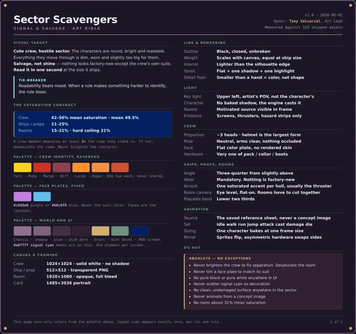
A collection holds the current state. The bible holds the decisions and the reasons behind them, which is the only thing that lets you safely change one later. Nobody can look at a collection and work out why room saturation is capped at 31%, or which rule wins when readability and mood disagree. That tie-breaker lives in the document or it doesn't exist anywhere.
The document is also the part that travels. It goes to a freelancer, a publisher, a storefront, a marketing team, a contractor doing one character while you do the rest. And it's what you review against, because you can't run a silhouette test or an in-situ composite from a collection setting. Checklists are a document thing.
The clearest case for writing it down is what happens when you measure. Our own art bible for Sector Scavengers puts the crew at 42–56% mean saturation and the rooms at 15–31%. Both of those were already true of the shipped art before anyone wrote a word. Writing them down is what turned an accident into a number a second artist can hit.
We have written separately about building a consistent game world with AI and about what a complete visual brief looks like in practice.
How to write one before you generate anything
Decide what you cannot compromise on. Pick two or three visual pillars, the things that if lost mean it is not your game any more. Everything else is negotiable, and saying so out loud stops the document becoming an unfalsifiable wish list.
Gather references, then annotate them. An unlabeled mood board is a decoration. Write on each image what specifically you are taking: this palette, not this rendering; this silhouette language, not this level of detail.
Make one asset by hand first, or commission one. A single finished, approved asset resolves more ambiguity than five pages of prose, and it gives you something to write the rules from rather than toward.
Convert every adjective into a constraint. "Warm" becomes eight hex values. "Chunky" becomes a head-to-body ratio and a minimum limb width in pixels. "Painterly" becomes a stated brush texture and a rule about how many value steps are allowed per surface. If a line in your bible cannot be checked by looking at an asset and answering yes or no, it is not finished.
“Warm”
The adjective names a feeling. The constraint names eight hex values. Writing them down is what turns an accident into a number a second artist can hit.
“Chunky”
Chunky becomes a head-to-body ratio and a minimum limb width in pixels. Both are measurable on the finished file.
“Painterly”
Painterly becomes a stated brush texture and a rule about how many value steps are allowed per surface. A surface either obeys the count or it does not.
Write the do-not-do list last, from real mistakes. After ten assets you will know what keeps going wrong. That is the section that earns its keep.
Then generate, and treat the first batch as a test of the document. Anything inconsistent in the output points at a gap in the bible, not a failure of the generator. Fix the input and regenerate.
Frequently asked questions
What is an art bible in game development?
An art bible is the reference document that defines every visual rule an in-game asset must follow, including palette, line treatment, silhouette, proportion, perspective, lighting, rendering, resolution and level of detail, so that art produced by different people at different times looks like one coherent game. It combines aesthetic direction with hard technical specs, and it is the authority anyone resolves a "does this look right?" question against.
What is the difference between an art bible and a style guide?
In practice the terms are used interchangeably. Where a distinction is drawn, an art bible is the complete visual reference including inspiration, concept art, character sheets and tone, while a style guide is the narrower rules-and-specs subset. Visual development, or visdev, is the exploratory phase before either exists, where you are still finding the look rather than documenting it.
How long should a game art bible be?
Shorter than you think, and specific throughout. A solo or small-team 2D game is well served by two to five pages. A large 3D production runs to dozens, but usually because it is really several documents under one cover. Length is not the quality signal; the ratio of checkable constraints to adjectives is.
When should you write an art bible?
After enough visual development that you know what the game looks like, and before production volume starts. Writing it too early locks in guesses. Writing it after fifty assets means the document is a description of accumulated accidents.
Do I need an art bible if I am a solo developer?
Yes, and arguably more than a team does. A team has review meetings that surface drift. A solo developer has only their own memory, which is the exact mechanism that fails over a long project. Even a one-page bible with a palette, a proportion rule and a do-not-do list will hold a two-year project together.
Does an art bible still matter if the art is AI-generated?
It matters more. Generated art does not fill in gaps with taste, so undefined territory comes back generic. The difference is what the document does: instead of being read and remembered, its rules become inputs to generation, so consistency is enforced rather than requested. You still have to make every one of the decisions listed above. You just stop having to re-enforce them by hand.
Write it either way
If you are hiring artists, the bible is the difference between a coherent game and a pile of individually good assets that don't sit together. If you are generating, it is the difference between a style and a slot machine.
Every field from this article is collected in a fill-in template, with a prompt and an example for each. Fill it in against art you have already made rather than art you are planning to make. If you are working in Makko, the filled-in version becomes your collection settings: set the look, feel and style once at the top, and every concept, reference sheet, animation and sprite sheet made inside it inherits it. Which is what an art bible was always trying to be.
Get the free fill-in art bible template: all 16 sections, with a prompt and an example for each.