What Four Public Game Art Bibles Actually Say
0 A.D., Liberated Pixel Cup, Wesnoth and Riot published their art bibles in full. Here is what they specify, plate by plate — and the one gap all four share.
Almost every article about art bibles is written by someone who has not read one. They list the headings: palette, silhouette, lighting. Then they stop, because headings are the easy part.
Four teams have published theirs in full, with the numbers still in. Reading them side by side is more useful than any amount of advice about what an art bible should contain, because it turns out they independently converged on the same five things.
They share one blind spot, and you should know it before you read a word of them. Not one of the four says anything about art that is generated rather than drawn. Every rule in all four assumes a human is making each asset and can be given feedback. For a lot of teams, probably including yours, that assumption stopped being true a while ago. Closing that gap is why we keep publishing this material. Read the four with it in mind. It changes which parts you should copy.
The short version. The four public art bibles worth your time are 0 A.D.'s Art Design Document, the Liberated Pixel Cup style guide, Battle for Wesnoth's Creating Unit Art, and Riot's League of Legends VFX style guide. Every one of them specifies a tie-breaker, a light direction with the ambiguity spelled out, a shadow color as an actual value, a level-of-detail floor tied to a real-world object, and a named list of the mistakes people keep making. Every one of them also stops at the same place: they are built to keep two artists from disagreeing, not to keep one generator from drifting away from itself over forty assets. That second document is the one Makko exists to write.
The one thing none of them covers
Before the teardowns, the caveat that determines how you should read them.
All four documents were written to prevent one specific failure: two artists disagreeing. That is what an art bible has historically been for. Several people, several hands, several opinions, and a document that makes their output look like it came from one place. Every rule in all four is shaped by that problem. A shadow hex so two people pick the same shadow. A light direction so two people light the same way. A canvas size so two people hand in the same rectangle.
A generated pipeline fails differently, and you notice much later.
There is only one source, so it never disagrees with itself the way two people do. Every output is internally consistent. Deliberate, confident, finished. The drift happens between generations. Asset forty has no memory of asset one. The armor trim creeps warmer. The outline thins. The light wanders around to the other shoulder. Nothing looks wrong on its own, which is exactly why nobody catches it until forty assets stand in one scene and the roster stops reading as one roster.
What all four were written to prevent
Two artists disagreeing.
Several hands, several opinions. Every rule in all four is shaped by that problem. A shadow hex so two people pick the same shadow, a light direction so two people light the same way, a canvas so two people hand in the same rectangle.
What a generated pipeline breaks on
One source, drifting from itself.
It never disagrees with itself the way two artists do. Every output is internally consistent. Deliberate, confident, finished. The drift happens between generations, and nothing looks wrong on its own. That is exactly why nobody catches it until forty assets stand in one scene.
The bridge. What has to be held identical across every generation
- Reserved color per character
- Silhouette envelope
- Canvas & baseline
- Light direction
- Outline treatment
- Frame count per animation
None of the four documents contains this section, because none of them faced the problem. It is the layer that used to live in one artist’s head, and in a generated pipeline it has to be written down and enforced on every render or the roster quietly stops matching.
The document that prevents that drift is a different document, and the six items above are its table of contents. It is less concerned with what the art should look like than with what must not move while it is being made.
That is the gap Makko is built to close. The constraint layer that used to live in one artist's head has to be written down and enforced on every render. Otherwise generated art drifts, and it drifts in the worst way: fine asset by asset, wrong in aggregate.
What follows is still the best available starting point for the half these four documents do cover, and that half is real. Read them for it.
0 A.D.. Art Design Document
Wildfire Games. 21 sections, covering an RTS with thousands of units on screen.
The most complete one anybody has published, and the best one to steal structure from. It runs from artistic theme through concept art, models, skins and textures, animations, folder structure and file naming conventions. The full production span, not just the look.
Two things it does that almost nothing else does.
It states a tie-breaker. Eight words: "Gameplay trumps Realism when the two topics disagree." The worked example is phalanx formations, which historically ran to 500-plus men and are capped at roughly 20 units because of screen space and pathfinding. That is a document that has already had the argument and written down who won.
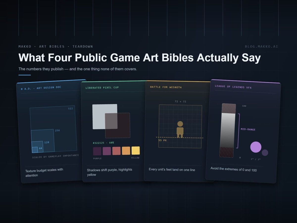
It scales budgets by how much the player looks at something. Texture sizes are assigned by gameplay importance rather than by object type:
Both rules travel. The ladder translates to 2D as canvas sizes rather than texture sizes, and the detail floor translates untouched. A human hand is a human hand at any resolution. That is why the sentence outlived the engine it was written for.
Liberated Pixel Cup. Style guide
OpenGameArt, with Mozilla and the Free Software Foundation. Written so strangers could contribute art that matched.
This one had a harder problem than the others: it needed people who had never met to produce interchangeable assets. That constraint forced a level of specificity the rest do not reach.
The camera is given as a number. "The camera angle is top-down, roughly 60 degrees," with rendering "orthographic, which means there is no perspective." Two sentences that eliminate an entire category of unusable submissions.
The grid is fixed at 32×32 with optional 16×16 sub-tiles, and characters get their own envelope: the base fits 32×48, clothing fits 48×64. Anyone can check a submission against that without asking a question.
Its outline rule carries a deliberate exception, and most documents would have flattened it into one line and been wrong. Outlines in general should be "a darker version of the current color, or a dark color generally, not black" But for characters, "the outlines should be black or near black, no selective outlining." A different rule for the thing the player is looking at.
It closes with a section titled "Things that are important enough to be worth repeating": no pure colors, vary the hues of color ramps, highlights yellowish and shadows purplish, block out before detailing. A recurring-mistakes list, placed last, where people will reread it.
Battle for Wesnoth. Creating Unit Art
The shortest of the four and the densest in figures.
Wesnoth's document reads like a spec sheet because that is what it is. The canvas is 72×72 pixels, and one line fixes the baseline across every unit anyone contributes. That is what makes a roster look like one roster rather than a pile of submissions.
4 frames minimum, 6 optimal, defenses are 2 frames not counting the base. And pure black #000000 is never used to outline a sprite.The light direction argument, settled twice
The most quietly useful thing in the Wesnoth document is a parenthesis. Light comes from "the artist's (not the unit's!) upper right." LPC resolves the same ambiguity in the other direction: light primarily from above, any side directionality from the left.
Riot Games. League of Legends VFX style guide
The only one here from a large studio, and the only one about effects rather than static art.
Riot's guide is about a narrower problem: visual effects in a game where twenty of them can fire at once. Its rules generalize further than the topic suggests.
The part more documents should copy is the hierarchy rule. Within a single effect, one element is primary and defines the focal point, and secondary elements use color value and saturation to support it. When complementary colors appear together, "one color must act as the secondary color." That is a rule about the internal composition of one asset, and almost no indie art bible has anything equivalent.
Underneath all of it sits readability: effects must be "easily readable within gameplay" so players have "a clear sense of an effect's purpose." Same tie-breaker as 0 A.D., arrived at from the opposite end of the industry.
What all four have in common
They were written by different teams, in different decades, for a 3D RTS, a 2D contributor jam, a turn-based strategy game and a MOBA. They share five things.
| What | Why it's there | Example |
|---|---|---|
| A stated tie-breaker | Two good rules will eventually contradict. Somebody has to have decided in advance which wins. | "Gameplay trumps Realism when the two topics disagree" |
| Light direction, disambiguated | "Upper left" is meaningless once a character turns around. | "the artist's (not the unit's!) upper right" |
| Shadow as a value | "Soft shadow" cannot be checked. A hex and an opacity can. | "#322125 at 60 percent opacity" |
| A detail floor | Stops an artist spending an hour on something nobody will see. | "Anything smaller than a human hand should not be modeled" |
| A named mistakes list | Recurring errors need names so reviewers can point at them in one word. | "Things that are important enough to be worth repeating" |
Notice what is not on that list. None of them lead with mood boards. None of them open with adjectives about atmosphere. Three of the four get to a hard number within the first screen of text.
The other gap: interface art
The generated-art gap is the large one, and it has its own section above. There is a second, smaller one to know about before you copy any of these wholesale.
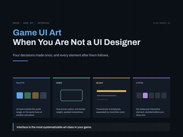
Only one of them has anything resembling an interface section. UI art collides with gameplay art constantly. A health bar that reads perfectly against a forest and disappears against snow is a UI problem discovered during a gameplay review. Its absence causes more rework than any other missing section. Riot's guide is about effects rather than interface, and the other three barely touch it.
Fill it in yourself rather than assuming the omission was deliberate.
 Card frame420 × 600
 Button600 × 429
 HUD panel600 × 389
How to use them
Do not read all four. Read the one closest to your problem, take its structure, and then steal the five common elements from wherever they are stated best.
| If you are making | Read | For |
|---|---|---|
| Anything, as your first one | 0 A.D. | Structure, the tie-breaker, budgets scaled by importance |
| 2D art with multiple contributors | Liberated Pixel Cup | Camera as a number, shadow as a hex, hue-shift instructions |
| Small sprites, tight roster | Battle for Wesnoth | Canvas, baseline, frame counts, outline rules |
| Effects, or anything with layered elements | Riot VFX | Value range discipline, primary and secondary hierarchy |
Then measure your own art rather than adopting their numbers. Wesnoth's 72×72 canvas is correct for Wesnoth. The method is what transfers: pick a canvas, state a baseline, write both down before the second asset.
And then add the section none of them has. Whatever route your art takes, write down what must not change between one asset and the next, and keep that list short enough to be checked in a minute. If a person is drawing, it is a list they read. If a generator is producing, it is a list something has to enforce on every render, because the generator will not remember on its own.
If you want to see what that looks like filled in for a specific game rather than described in the abstract, our art bible template is completed for a real project with measured values, and there is a blank version at the bottom of it. The Godot 2D art production spec is the delivery half split out on its own.
Frequently asked questions
Are there any public game art bibles?
Four are worth reading in full: 0 A.D.'s Art Design Document from Wildfire Games, the Liberated Pixel Cup style guide from OpenGameArt, Creating Unit Art from Battle for Wesnoth, and Riot's League of Legends VFX style guide. Most studios never publish theirs, which is why the open-source ones carry so much weight.
Do any of them cover AI-generated art?
None of them, and it is the largest gap in all four. Every rule in every one of these documents assumes a human makes each asset and can be given feedback, because the failure they were built to prevent is two artists disagreeing. A generated pipeline fails the opposite way: one source producing many internally-consistent outputs that quietly drift apart across a roster. That needs a section on what is held constant between generations, reserved colors, silhouette envelope, canvas and baseline, light direction, outline treatment, frame counts, and none of the four had any reason to write it.
Which public art bible is the most complete?
0 A.D.'s, at 21 sections covering theme, concept art, models, textures, animation, folder structure and naming. It is also the one whose structure translates most easily to a different project.
What do all good art bibles include?
A stated tie-breaker for when two rules conflict, a light direction with the artist-versus-character ambiguity resolved, shadow specified as a color value rather than an adjective, a level-of-detail floor tied to a real-world object, and a named list of the mistakes the team keeps repeating. If your art is generated rather than drawn, add a sixth: the list of properties that must not change between one generation and the next.
Should I copy one of these for my game?
Copy the structure, not the numbers. A 72×72 canvas and a 60-degree camera are correct for the projects that chose them. Measure your own art and write down what you find.
Why do these documents specify light direction so carefully?
Because "light comes from the upper left" is ambiguous the moment a character can face either way. Wesnoth resolves it as the artist's upper right, LPC as primarily from above with any side bias from the left. They disagree, and it does not matter. What matters is that each one settled it once in writing.