
Value Does the Work That Color Gets Credit For
Give every layer of the scene a value band and forbid the overlap. The grayscale pass, four named failures, and what value cannot fix.
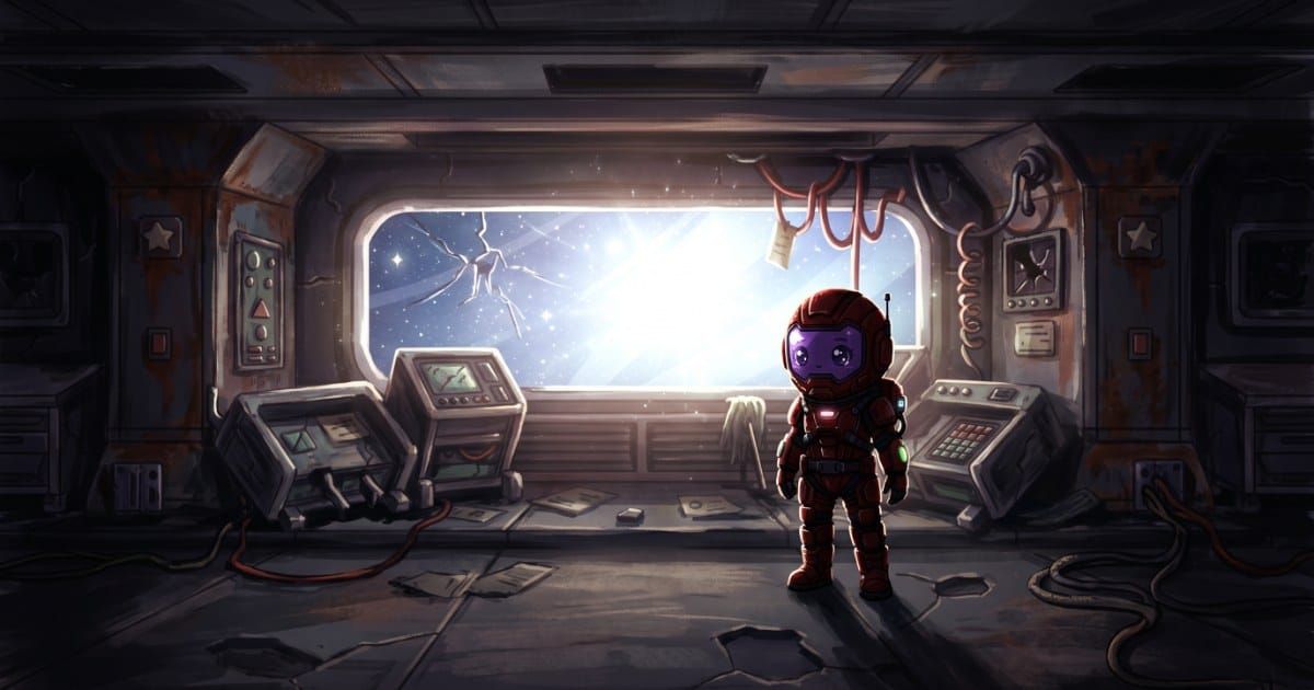
You can profile a frame, find a race condition, and read a spec sheet. You cannot look at a screenshot of your own game and say why it reads as mush. That gap feels like a talent problem, so it gets handed to whoever draws. It is a measurement problem.
Value structure decides whether a scene reads instantly or has to be parsed. Unlike hue, it can be written as numbers, handed to whoever produces the art, and verified on delivery by someone who has never held a brush. The most consequential visual property is also the cheapest to check, so it is the highest-return thing a non-artist can learn.
The short version. Give every layer in your render order a value band on a 0 to 100 lightness scale, and forbid adjacent bands from fully overlapping. Verify by desaturating real screenshots and reading lightness numbers off the pixels with an eyedropper, not by squinting. Separation between a character and a room is a band difference, and depth is a band difference compressing with distance. Both are specifiable without drawing. Value will not make a scene beautiful. It will make it readable.
Value is how light a thing is, and that is the whole definition
Value is lightness: where a color sits on the scale from black to white, with the color part discarded. A saturated red, a muddy olive and a flat gray can all sit at the same value, and when they do, the eye treats them as equally distant and equally important. Every image editor reports it, most as the L in HSL or the V in HSV. Nothing else about color theory is needed here.
Two consequences, both operational. Value is where the eye finds shapes, so it controls readability outright. And because it is one number per pixel, it can be specified, sampled and compared like any other budget.
Give every layer a band and forbid the overlap
This is the core of the method. Take the layers your renderer already draws in order, give each a range on a 0 to 100 lightness scale, then write the rule that makes the ranges mean something: adjacent layers may not fully overlap, and nothing else enters the player's band. A starting set for a game where the cast reads light against darker rooms:
| Layer | Band | Why |
|---|---|---|
| Far background | 15 to 35 | Dark, narrow, nothing reads as an object |
| Midground architecture | 25 to 50 | Room identity, still below the cast |
| Play band surfaces | 20 to 40 | Quiet where characters stand |
| Props and interactables | 45 to 75 | Above the room, below the player |
| Player character | 55 to 90 | Widest band, owns the top |
| Interface | 30 to 70 | Never brighter than the cast |
| Effects | any, briefly | Exception, stated duration |
The bands overlap at the edges on purpose, since zero overlap produces posters rather than scenes. What matters is that no two adjacent layers occupy the same range: a five to fifteen point gap between band centers is enough for the eye to sort them. The player gets the widest band because a character needs internal range to have form at all. The interface sits in the middle rather than the top, and that surprises people.
Invert the table if your cast reads dark against bright rooms: the structure holds, the numbers flip. Deciding per room does not work, since a character cannot be light in one place and dark in another and stay the same character.
Do this before any finished asset exists. Assigning bands is twenty minutes of typing. Finding out after fifty assets that your midground and your cast share a range is a repaint of fifty assets.
Separation is a band difference, not a hue difference
A character reads against a room because their value bands differ. Not because their hues differ. An orange character against a blue wall at identical lightness is a character you lose, and players report that as the art being busy or the level confusing, never as a value collision.
Separation being the room's job is settled elsewhere. The value side is the part you can put numbers on. Sample the wall behind your character where they are hardest to see, then the character's largest continuous area, the torso or the coat, not a highlight. Subtract. Under about 10 points on a 0 to 100 scale, you have found the bug, and no hue change will fix it.
A gap too small everywhere means your bands are wrong and the whole room goes down. A gap that collapses in one place means a single asset is out of band.
Atmospheric perspective is a value rule you can implement
Painters call it atmospheric perspective. For your purposes it is one sentence: the further something is, the more its value compresses toward the value of the backdrop. A distant mountain range reads as flat pale shapes, the tree next to you does not.
Written as a spec, it is a haze factor per layer. Each layer's pixels get pulled toward one haze color by a fixed amount, rising with distance: the far layer at 60 percent pulled, the midground at 25, the play band at 0. The haze color is the backdrop's own average value, not white and not gray, since white haze in a dark room reads as fog rolling in rather than as distance.
Two ways into the build. Baked, so each layer is authored already compressed, free at runtime and impossible to tune. Or a per-layer tint parameter that lerps the sprite toward the haze color by that layer's factor, a handful of lines and a slider. Prefer the slider.
One rule keeps this a value tool rather than a painting technique: compressed layers must land inside their assigned band. If your far layer was authored at 15 to 35 and 60 percent haze pushes it to 30 to 45, it has climbed into the midground band and you have flattened the room by trying to add depth to it.
The grayscale pass, as a procedure
Desaturating and looking is the first pass. Here is the full one.
- Capture five screenshots, not one. Busiest room, darkest room, the room with the most interface on screen, a combat moment, and the first screen a new player sees. Character composited in, HUD on, real resolution.
- Scale each to the size a player sees. A background judged at 200 percent zoom is a background you have not judged.
- Convert to grayscale and look at each for two seconds. Where does your eye land first. Write it down before looking again, since the second look is contaminated.
- Trace the player's silhouette with your finger. If you cannot follow the outline without hunting, separation fails somewhere along it. Mark where.
- Eyedropper the pairs that touch. Character against wall, interface against its backing, interactable against floor. Sample the L in HSL and compare to your contract. People skip this step, and it produces the evidence.
- Check the corners last. Crop the center out. Anything bright in what remains is taking attention it should not have.
Failures show up as observations, not feelings. Your eye lands on something that is not the player. You cannot trace the silhouette. Two values that should differ by 15 differ by 4. Each is a defect with a known location, so each becomes a ticket rather than an opinion. Step 5 automates: a script that prints the mean lightness of named rectangles runs in CI and catches band drift on delivery.
Four value failures, with their tells and their fixes
1. Everything in the same band. The scene reads as one substance. Tell: in grayscale the whole image sits in the middle third, and you cannot say where one object ends and the next begins without reasoning it out. Fix: push the background band down 15 points before touching anything else. The instinct is to brighten the character, and that gives you a glowing character in a soup.
2. The character shares the background's band in one area only. Tell: the player is fine in most of the room and vanishes over one doorway, one lit panel, one patch of floor. Testers report the game as hard to follow in one specific place, which is the most useful bug report you will get. Fix: the offending patch, not the character. Cap that asset to the room's band. Changing the character to survive one panel breaks them in nine other rooms.
3. An interface element brighter than the player. Tell: desaturate with the HUD on and the brightest region is a health bar fill, a button face, or a notification badge. Fix: cap the interface band below the player's and build the HUD's internal hierarchy with value steps inside that band rather than by reaching for white. An interface that has to be the brightest thing to stay legible has a contrast problem against its own backing, and that is a relationship between the UI and the world to settle once, not per screen. The cap covers icons too: a badly capped icon often both stops reading at shipping size and steals attention at full size.
4. A high-value distractor in a corner. Tell: in the two-second look your eye goes to the edge of the frame, usually a light fixture, a window, a sign, or a highlight on a prop rendered with more love than its importance justifies. Fix: pull its value into its layer's band, or move it behind something.
Local contrast is why a full value range can still read badly
A scene can span 0 to 100 and still be unreadable, which is how a histogram-level check passes scenes that fail in play. Global contrast is the range across the frame. Local contrast is the difference between two things that touch, and the eye only reads local contrast, because separation happens at boundaries. A frame with a black void at the top, a white light at the bottom, and a character at 45 against a wall at 48 has enormous global contrast and none where it matters.
So measure pairs, not images. Per scene, list the boundaries that carry gameplay meaning: player against floor, player against wall, interactable against its surface, enemy against everything, interface against its backing. Range not spent at those boundaries is decoration.
This explains a repair that seems backward. Sometimes the fix is to reduce the background's range, flattening a busy wall so the remaining contrast lands on the player. Adding contrast to a frame that already has too much is how scenes get louder without getting clearer.
The value contract, in one block
Copy this into your art bible and check every delivery against it.
# [GAME] - Value contract v0.1
# Scale: lightness 0 = black, 100 = white

## Reading direction
cast reads = [ light on dark / dark on light ]   # global, never per room

## Bands per layer  (render order, back to front)
far background       = [    ] to [    ]   haze = [   ]%
midground            = [    ] to [    ]   haze = [   ]%
play band surfaces   = [    ] to [    ]   haze = 0%
props / interactables = [    ] to [    ]
player character     = [    ] to [    ]   <- owns the top
enemies              = [    ] to [    ]
interface            = [    ] to [    ]   <- below the player, always
foreground occluders = [    ] to [    ]   haze = [   ]%

## Rules
- no adjacent bands fully overlap; band centers differ by >= [ 10 ]
- nothing enters the player's top [ 15 ] points
- haze color = average value of the far background, not white, not gray
- hazed layers must land inside their own band after hazing

## Required local contrast  (measured at the boundary, not the histogram)
player vs wall behind    >= [ 15 ]
player vs floor          >= [ 12 ]
interactable vs surface  >= [ 12 ]
interface vs its backing >= [ 20 ]

## Exceptions
effects may exceed any band for [    ] ms
[ other, with duration ]

## Delivery check
5 screenshots, play size, HUD on, grayscale
eye lands on player / silhouette traceable / pairs meet the minimums
What value cannot fix
The method has a hard ceiling. Value structure will not make a scene attractive: a room with perfect band separation can be ugly, generic and forgettable, and you will not be able to say why. It will not give you light logic, whether every surface agrees about where the light comes from. It will not give you material, so correct values on a steel wall that reads as painted cardboard stay cardboard. It will not produce composition, a frame that leads the eye on purpose rather than merely not misleading it. And it does nothing for appeal.
Value structure is the floor. It makes a game readable, and readable is not optional. Everything above the floor is craft, and craft is what you pay a painter for. The same split runs through the programmer's overview of game art: specifying and judging are yours, producing is not.
So the hiring signal is precise. When five screenshots pass the grayscale procedure and the game still looks amateur, you have exhausted what specification can do. Before that point, a painter hired to fix a value problem gets you a prettier unreadable scene.
Frequently asked questions
Does this work for pixel art and very low resolution sprites?
It works harder there. Fewer pixels carry each shape, so value separation does nearly all the work and no detail rescues a bad band. Sort your palette by lightness and check that different layers' ramps land in different parts of the sort. Palettes heavy in the middle are the usual culprit behind pixel art that goes muddy at size.
My game has a day and night cycle. Do the bands move?
The bands move together, the relationships do not. Treat the cycle as a transform on the whole scene, then verify the local contrast minimums hold at the extremes. Night is where it breaks, because backgrounds get darkened by a multiplier while the character is often exempted. Run the pass at the darkest and brightest points, not at noon.
How do I give this to an artist or a generator?
Hand over the contract block. Artists who work in value read it immediately, since it is how they already think, and the numbers save them guessing. For generated work the bands become constraints enforced at production time rather than checked afterward, and Makko bakes a cast, a room set and an interface against one definition set.
What if my art is already made and fails the check?
Measure first, then fix the cheapest category. Layer-wide problems often come out with a tint or multiply pass at runtime, no reauthoring. Single-asset problems need that asset redone. Character-wide problems are the expensive case, since a cast in the wrong band changes everywhere at once. Sort failures by category, and most of the damage usually sits in one or two backgrounds.